In 2012, when I was at the final stage of my PhD to write a thesis, I put “learning LaTeX” on my to-do list. Early 2021, I finally remove the item from the list. I read the Learn LaTeX in 30 minutes article from Overleaf, and then immediately started using it. When I encountered some problems along the way, I just Google them. This way of learning is not very systematic, but it does the job.
This project page contains code snippets to achieve some specific effects in Latex and Beamer. I need to doccument this for future reference, since I used them frequently, but not frequent enough to remember them in my head.
Temporarily change format
The curly brackets {} can be used for this.
% example 1, change color
{\color{blue} This will be blue}, but this will be back to default colour

% example 2, change the title frame, not the rest
{
    \metroset{background=dark}
    \maketitle
}
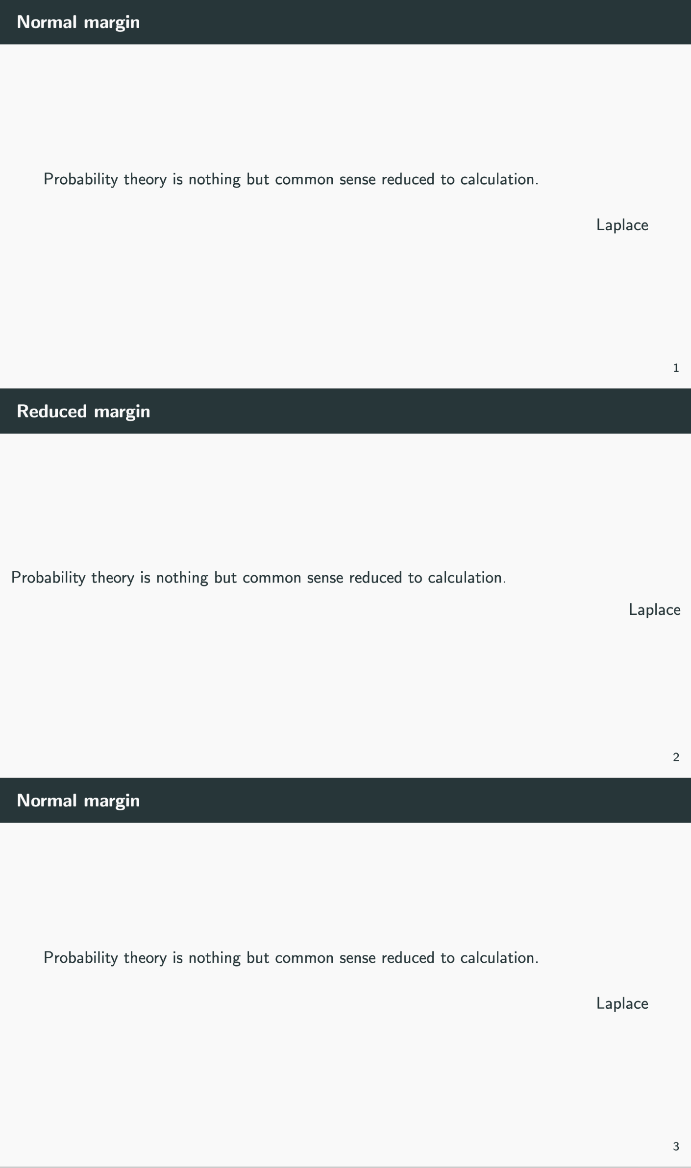
Temporarily change the margin of a frame
In Beamer, a quick and dirty way is to create a column (not columnonlywidth) environment and then create just one column with 1.1 or 1.15 textwidth
\begin{frame}
    \begin{columns}
       \column{1.1\textwidth}
       Your content
    \end{columns}
\end{frame}
A more elegant way from Tex FAQ is to define a new environment. This solution is more gerenal.
\documentclass[aspectratio=169]{beamer}
\usepackage[utf8]{inputenc}
\usepackage[export]{adjustbox}
\usepackage{graphicx,amsmath,ragged2e}
\usetheme{metropolis}

%% define a new environment in the preamble
\newenvironment{changemargin}[2]{%
  \begin{list}{}{%
    \setlength{\topsep}{0pt}%
    \setlength{\leftmargin}{#1}%
    \setlength{\rightmargin}{#2}%
    \setlength{\listparindent}{\parindent}%
    \setlength{\itemindent}{\parindent}%
    \setlength{\parsep}{\parskip}%
  }%
  \item[]}{\end{list}}
%%

\begin{document}

% frame 1, normal margin
\begin{frame}{Normal margin}
    Probability theory is nothing but common sense reduced to calculation.
    \flushright
    Laplace
\end{frame}

% frame 2, small margin
\begin{frame}{Reduced margin}
    \begin{changemargin}{-0.75cm}{-0.75cm}
        Probability theory is nothing but common sense reduced to calculation.
        \flushright
        Laplace
    \end{changemargin}
\end{frame}

% frame 3, back to normal margin
\begin{frame}{Normal margin}
    Probability theory is nothing but common sense reduced to calculation.
    \flushright
    Laplace
\end{frame}

\end{document}
Here is the output:
Draw curved arrows
The curve is automatically determined when you set the angle of out and in. Note you need to use to between two coordinates.
% in order to draw small arrow head, i.e. using >={Triangle[scale width=0.5]} in the following example
% you need to put \usetikzlibrary{arrows.meta} in the preamble

\begin{tikzpicture}
    \draw[very thick, ->, >={Triangle[scale width=0.5]}, out=225, in=90] (5, 5) to (4, 3);
\end{tikzpicture}
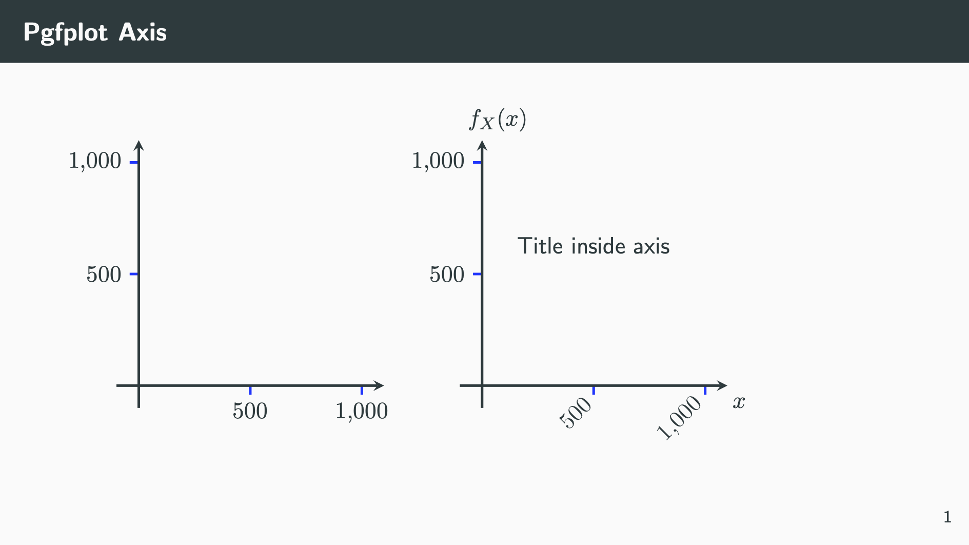
Pgfplots axis tuning
The following are commonly used paramters for tuning axis and labels
% The [baseline] option helps vertical alignment of two plots side by side
% Note the x ticklabel rotation pushes the 2nd plot up, but thanks to [basesline],
% they still align

\begin{frame}{Pgfplot Axis}
    \begin{tikzpicture}[baseline]
        \begin{axis}[
            height=6cm, width=6cm, axis on top,
            axis x line=middle, axis y line=middle, axis line style=very thick,
            tick style={very thick, blue}, tick align=outside, scaled ticks=false,
            xmin=-100, xmax=1100, ymin=-100, ymax=1100,
            enlargelimits=false
            ]
        \end{axis}
    \end{tikzpicture}
    \begin{tikzpicture}[baseline]
        \begin{axis}[
            % size and general
            height=6cm, width=6cm, axis on top,
            % use axis x/y line* to remove arrows in the axis line
            axis x line=middle, axis y line=middle,
            % tick alignment and colour, can do separately with xtick style and ytick style
            axis line style=very thick, tick style={very thick, blue}, tick align=outside,
            % turn off the annoying automatically scaling
            scaled ticks=false,
            xticklabel style={rotate=45, anchor=east, font=\small, /pgf/number format/fixed},
            xmin=-100, xmax=1100, ymin=-100, ymax=1100,
            % control label position, cs stands for coordinate system
            xlabel=$x$, x label style={at={(axis description cs:1.1,-0.03)}},
            ylabel=$f_{X}(x)$, y label style={at={(axis description cs:0,1.15)}},
            title={Title inside axis}, title style={at={(axis description cs:0.5,0.5)}},
            enlargelimits=false
            ]
        \end{axis}
    \end{tikzpicture}
\end{frame}
Output:
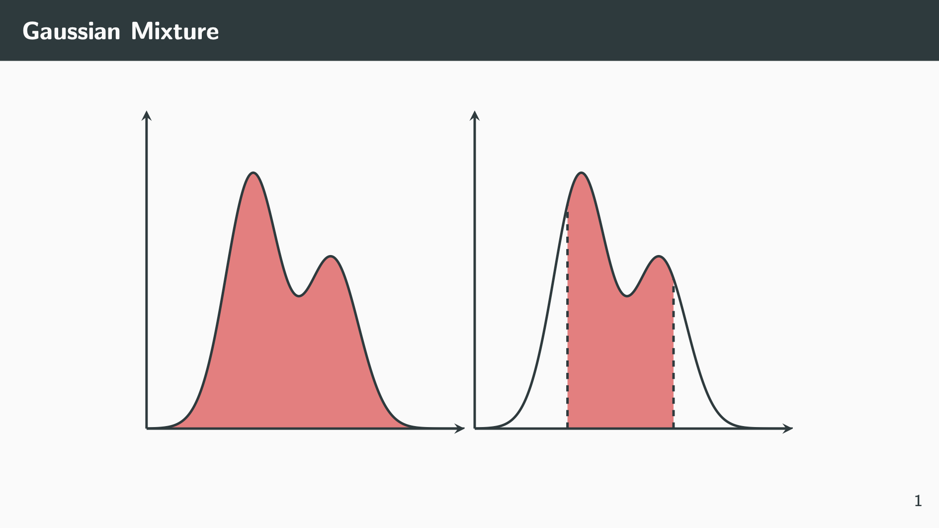
Gauss curve plotting
%% put the following in the preampble

% define gauss function:
\pgfmathdeclarefunction{gauss}{2}{
  \pgfmathparse{1/(#2*sqrt(2*pi))*exp(-((x-#1)^2)/(2*#2^2))}
}

%% Then do the plotting

\begin{frame}{Gaussian Mixture}
    \centering
    \begin{tikzpicture}
        \begin{axis}[axis x line=bottom, axis y line=left, width=7cm, height=7cm, axis line style=very thick,
                     axis on top, xtick=\empty, ytick=\empty, xmin=-6, xmax=6, ymin=0, ymax=0.3]
            \addplot [draw=none, samples=200, smooth, fill=red!50, domain=-6:6,] {0.6*gauss(-2,1) + 0.4*gauss(1,1)} \closedcycle;
            \addplot [very thick, samples=200, smooth, domain=-6:6] {0.6*gauss(-2,1) + 0.4*gauss(1,1)};
        \end{axis}
    \end{tikzpicture}
    \begin{tikzpicture}
        \begin{axis}[axis x line=bottom, axis y line=left, width=7cm, height=7cm, axis line style=very thick,
                     axis on top, xtick=\empty, ytick=\empty, xmin=-6, xmax=6, ymin=0, ymax=0.3]
            \addplot [draw=none, samples=200, smooth, fill=red!50, domain=-2.5:1.5] {0.6*gauss(-2,1) + 0.4*gauss(1,1)} \closedcycle;
            \addplot [very thick, samples=200, smooth, domain=-6:6] {0.6*gauss(-2,1) + 0.4*gauss(1,1)};
            \addplot [very thick, dashed] coordinates {(-2.5,0) (-2.5,0.211)};
            \addplot [very thick, dashed] coordinates {(1.5,0) (1.5,0.141)};
        \end{axis}
    \end{tikzpicture}
\end{frame}
Output:
Use xshift and yshift in tikzpicture
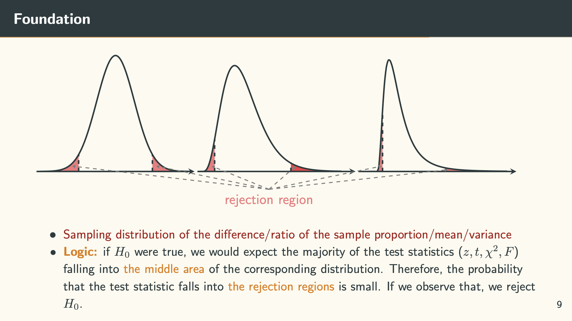
This is useful when you want to plot multiple axes in one tikzpicture and annotate them together using other drawings.
% in order to draw small arrow head, i.e. using >={Triangle[scale width=0.5]} in the following example
% you need to put \usetikzlibrary{arrows.meta} in the preamble

\begin{frame}{Foundation}
    \vspace{10pt}
    \begin{tikzpicture}
    \begin{axis}[width=6cm, height=5cm, axis on top, axis line style=very thick, tick style=very thick,
                 axis x line = bottom, axis y line=none, xtick=\empty, xmin=-4.2, xmax=4.2, ymin=0,ymax=0.42]
        \addplot [draw=none, smooth, domain=-4:-1.96, samples=100, fill=red!50] {gauss(0,1)} \closedcycle;
        \addplot [very thick, dashed] coordinates {(-1.96,0) (-1.96,0.058)};
        \addplot [draw=none, smooth, domain=1.96:4, samples=100, fill=red!50] {gauss(0,1)} \closedcycle;
        \addplot [very thick, dashed] coordinates {(1.96,0) (1.96,0.058)};
        \addplot [very thick, smooth, domain=-4:4, samples=100] {gauss(0,1)};
    \end{axis}

    \begin{axis}[xshift=4.5cm, width=6cm, height=5cm, axis on top, axis line style=very thick, tick style=very thick,
                 axis x line = bottom, axis y line=none, xtick=\empty, ymin=0, ymax=0.12, xmin=-1, xmax=33]
        \addplot [draw=none, smooth, fill=red!50] table [x=xs, y=ys, col sep=comma] {../data/chi_df_9_lower.csv} \closedcycle;
        \addplot[draw=none, very thick, fill=red!70] table [x=xs, y=ys, col sep=comma] {../data/chi_df_9_upper.csv} \closedcycle;
        \addplot[very thick, smooth] table [x=xs, y=ys, col sep=comma] {../data/chi_df_9.csv};
        \addplot[very thick, dashed] coordinates {(2.7,0) (2.7,0.032)};
        \addplot[very thick, dashed] coordinates {(19.1,0) (19.1,0.009)};
    \end{axis}

    \begin{axis}[xshift=9cm, width=6cm, height=5cm, axis on top, axis line style=very thick, tick style=very thick,
                 axis x line = bottom, axis y line=none, xtick=\empty, xmin=-1, xmax=7.5, ymin=0]
        \addplot[draw=none, smooth, fill=red!50] table [x=xs, y=ys, col sep=comma] {../data/f_df_9_10_lower_tail.csv} \closedcycle;
        \addplot[very thick, dashed] coordinates {(0.3,0) (0.3,0.4)};
        \addplot[draw=none, smooth, fill=red!50] table [x=xs, y=ys, col sep=comma] {../data/f_df_9_10_upper_tail.csv} \closedcycle;
        \addplot[very thick, dashed] coordinates {(3.7,0) (3.7,0.023)};
        \addplot[smooth, very thick] table [x=xs, y=ys, col sep=comma] {../data/f_df_9_10.csv};
    \end{axis}

    \draw[->, thick, >={Triangle[scale=0.5]}, gray, dashed] (6.5,-0.5) -- (1,0.15);
    \draw[->, thick, >={Triangle[scale=0.5]}, gray, dashed] (6.5,-0.5) -- (3.35,0.15);
    \draw[->, thick, >={Triangle[scale=0.5]}, gray, dashed] (6.5,-0.5) -- (4.9,0.15);
    \draw[->, thick, >={Triangle[scale=0.5]}, gray, dashed] (6.5,-0.5) -- (7.25,0.15);
    \draw[->, thick, >={Triangle[scale=0.5]}, gray, dashed] (6.5,-0.5) -- (9.65,0.15);
    \draw[->, thick, >={Triangle[scale=0.5]}, gray, dashed] (6.5,-0.5) -- (11.5,0.05) node [pos=0, anchor=north] {\color{red!50} rejection region};
    \end{tikzpicture}

    \begin{itemize}
        \item \small \textcolor{darkred}{Sampling distribution of the difference/ratio of the sample proportion/mean/variance}
        \item \small \textbf{\alert{Logic:}} if $H_0$ were true, we would expect the majority of the test statistics ($z,t,\chi^2,F$) falling into \alert{the middle area} of the corresponding distribution. Therefore, the probability that the test statistic falls into \alert{the rejection regions} is small. If we observe that, we reject $H_0$.
    \end{itemize}
\end{frame}
Output:
Fill an area with colour in tikzpicture
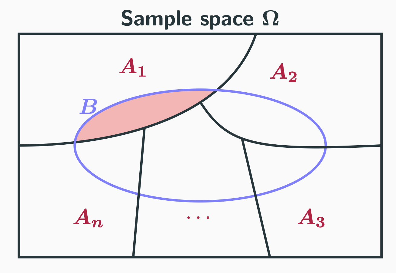
This is very helpful when drawing a Venn diagram. It can be done using the scope environment and the \clip command.
\begin{tikzpicture}
    % the relevant code starts here
    \begin{scope}
        \clip (0,0) circle [x radius=2.25, y radius=1];
        \fill[fill=red!30] (-3.25,0) .. controls (-1.5,0) and (0.5,0.5) .. (1,2);
    \end{scope}

    \draw[very thick] (-3.25,-2) rectangle (3.25,2);
    \draw[very thick] (-3.25,0) .. controls (-1.5,0) and (0.5,0.5) .. (1,2);
    \draw[very thick, blue!50] (0,0) circle [x radius=2.25, y radius=1] (-2,0.7) node {\color{blue!50} $\boldsymbol{B}$};
    % the end of the relevant code
    % the rest are not related to the colour fill
    % but some other things to make the picture complete

    \draw[very thick] (0,0.78) .. controls (0.5,0) and (1,-0.1) .. (3.25,0)
                      (0.75,0.125) -- (1.25,-2)
                      (-1,0.3) -- (-1.2,-2);
    \draw (0,2.25) node {\textbf{Sample space $\boldsymbol{\Omega}$}};
    \draw (-1.2,1.4) node[purple] {$\boldsymbol{A_1}$}
          (1.5,1.3) node[purple] {$\boldsymbol{A_2}$}
          (2,-1.3) node[purple] {$\boldsymbol{A_3}$}
          (0,-1.3) node[purple] {$\cdots$}
          (-2, -1.3) node[purple] {$\boldsymbol{A_n}$};
\end{tikzpicture}
Output:
Rotate axes
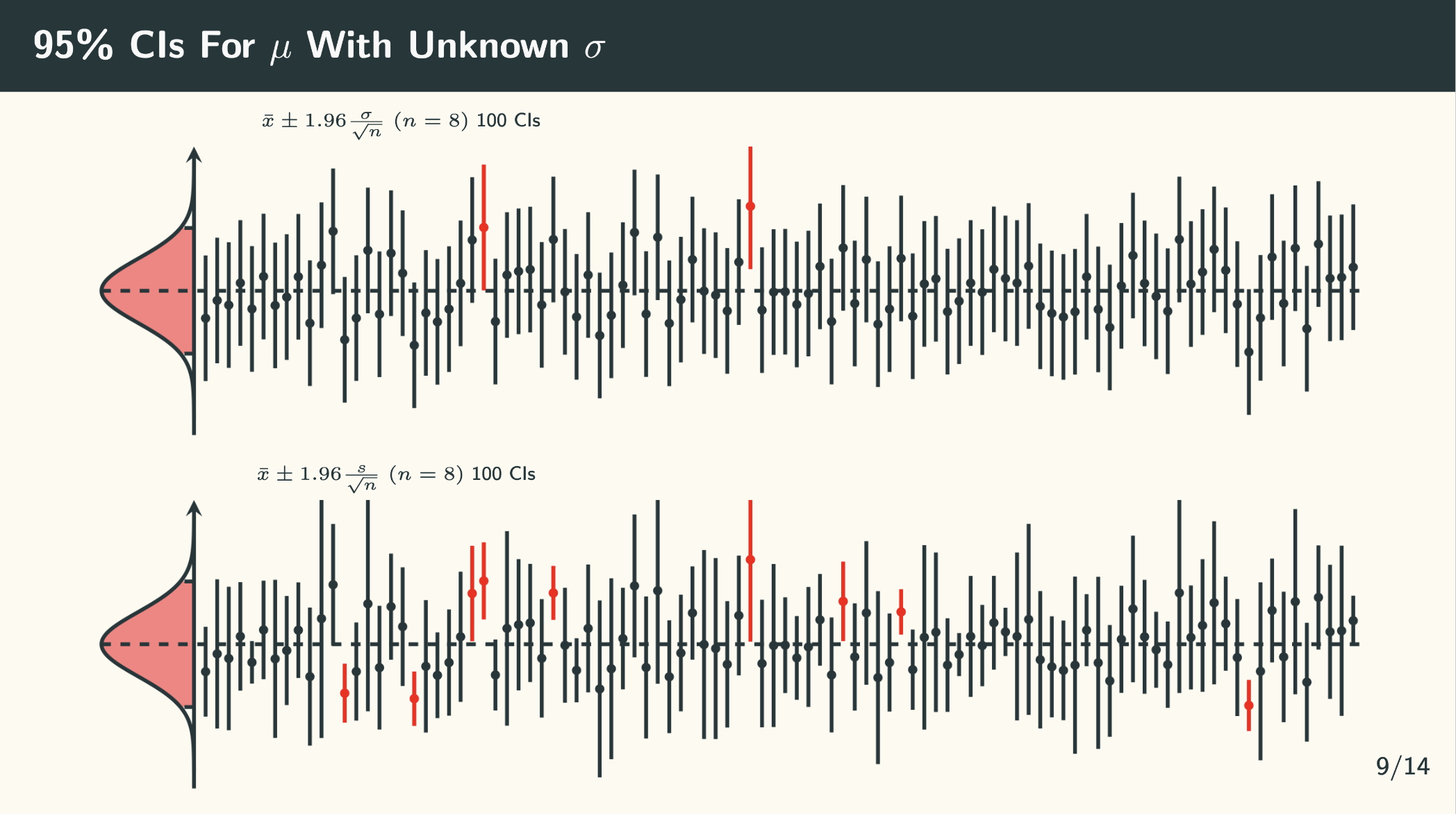
Use the combination of origin (can be center or origin) and anchor (can be axis.center or axis.origin) for the adjustment. The \DTLloaddb[noheader=false]{<name>}{<file>} command is from the
datatool package.
\begin{frame}{95\% CIs For $\mu$ With Unknown $\sigma$}
    \DTLloaddb[noheader=false]{coordin2}{../data/95ci_known_sigma_coordinates_in2.csv}
    \DTLloaddb[noheader=false]{coordout2}{../data/95ci_known_sigma_coordinates_out2.csv}
    \DTLloaddb[noheader=false]{coordin3}{../data/95ci_unknown_sigma_coordinates_in2.csv}
    \DTLloaddb[noheader=false]{coordout4}{../data/95ci_unknown_sigma_coordinates_out2.csv}
    \hspace{50pt} \tiny $\bar{x} \pm 1.96 \frac{\sigma}{\sqrt{n}}\ (n=8)$ 100 CIs

    \vspace{-5pt}
    \begin{tikzpicture}
        \begin{axis}[axis line style=very thick, axis on top, axis x line=middle, axis y line=none,
                width=0.4\textheight, height=\textwidth, enlargelimits=false, scale only axis,
                xtick=\empty, ytick=\empty, xmin=-4.5, xmax=4.5, ymax=0.45, ymin=-5.05,
                anchor={center}, rotate around={90:(current axis.center)}]
            \addplot [fill=red!50, draw=none, domain=-1.96:1.96] {gauss(0,1)} \closedcycle;
            \addplot [very thick, smooth, samples=100, domain=-4:4] {gauss(0,1)};
            \addplot [very thick, dashed] coordinates {(-1.96, 0) (-1.96, 0.0584)};
            \addplot [very thick, dashed] coordinates {(1.96, 0) (1.96, 0.0584)};
            \addplot [very thick, dashed] coordinates {(0, 0.4) (0, -5.05)};
            \addplot [only marks, mark size=1.25pt] table [x=x, y=y, col sep=comma] {../data/95ci_known_sigma_coordinates_in2.csv};
            \addplot [only marks, mark size=1.25pt, red] table [x=x, y=y, col sep=comma] {../data/95ci_known_sigma_coordinates_out2.csv};
            \DTLforeach*{coordin2}{\x=x, \y=y}{\addplot [very thick] coordinates {(\x-1.96,\y) (\x+1.96,\y)};}
            \DTLforeach*{coordout2}{\x=x, \y=y}{\addplot [very thick, red] coordinates {(\x-1.96,\y) (\x+1.96,\y)};}
        \end{axis}
    \end{tikzpicture}

    \hspace{50pt} \tiny $\bar{x} \pm 1.96 \frac{s}{\sqrt{n}}\ (n=8)$ 100 CIs

    \vspace{-5pt}
    \begin{tikzpicture}
        \begin{axis}[axis line style=very thick, axis on top, axis x line=middle, axis y line=none,
                width=0.4\textheight, height=\textwidth, enlargelimits=false, scale only axis,
                xtick=\empty, ytick=\empty, xmin=-4.5, xmax=4.5, ymax=0.45, ymin=-5.05,
                anchor={center}, rotate around={90:(current axis.center)}]
            \addplot [fill=red!50, draw=none, domain=-1.96:1.96] {gauss(0,1)} \closedcycle;
            \addplot [very thick, smooth, samples=100, domain=-4:4] {gauss(0,1)};
            \addplot [very thick, dashed] coordinates {(-1.96, 0) (-1.96, 0.0584)};
            \addplot [very thick, dashed] coordinates {(1.96, 0) (1.96, 0.0584)};
            \addplot [very thick, dashed] coordinates {(0, 0.4) (0, -5.05)};
            \addplot [only marks, mark size=1.25pt] table [x=x, y=y, col sep=comma] {../data/95ci_unknown_sigma_coordinates_in2.csv};
            \addplot [only marks, mark size=1.25pt, red] table [x=x, y=y, col sep=comma] {../data/95ci_unknown_sigma_coordinates_out2.csv};
            \DTLforeach*{coordin3}{\x=x, \y=y, \r=r}{\addplot [very thick] coordinates {(\x-\r,\y) (\x+\r,\y)};}
            \DTLforeach*{coordout4}{\x=x, \y=y, \r=r}{\addplot [very thick, red] coordinates {(\x-\r,\y) (\x+\r,\y)};}
        \end{axis}
    \end{tikzpicture}
\end{frame}
Output:
