Recently, I have the idea of adding some photos taken by me at the end of a post. I do not have a professional camera, and I just use my mobile phone. This is just for fun and for the sake of record keeping. The idea I have in mind is to show a 3-by-3 photo grid at the end of the post, because I like a 3-by-3 grid. Everybody likes 3-by-3 grids, right? In Chinese, we call it “九宫格”.
What I wanted to achieve is to preview nine photos in a 3-by-3 photo grid and the full-sized photo will be shown when I click one of them. Conceptually, this is a straightforward thing to do. There are definitely available tools for this purpose, because we see this functionality very often on the internet. In past I probably will Google a bit, and perform some trials and errors. Now we are all embracing AI, so I just ask DeepSeek. After a few conversations in just a few minutes, I manage to achieve what I want.
Here is the post to record the procedure that DeepSeek told me and the tweaks I made. If you like, you can view the entire conversions by clicking here. It turns out that Lightbox is doing exactly what I want. The idea is to create a shortcode to load Lightbox and setup the options. Then we call the shortcode in the markdown file when we write the post.
To use Lightbox to create a photo grid in Hugo, we first create the file layouts/shortcodes/photo-grid.html file as our shortcode. The content of this file is:
<div class="photo-grid">
  {{ range $index, $src := .Params }}
    <div class="photo-grid-item">
      <a href="{{ $src }}" data-lightbox="photo-grid-{{ $.Ordinal }}" data-title="Photo {{ add $index 1 }}">
        <img src="{{ $src }}" alt="Photo {{ add $index 1 }}" loading="lazy">
      </a>
    </div>
  {{ end }}
</div>

<!-- Include Lightbox2 CSS & JS -->
<link rel="stylesheet" href="https://cdnjs.cloudflare.com/ajax/libs/lightbox2/2.11.3/css/lightbox.min.css">
<script src="https://cdnjs.cloudflare.com/ajax/libs/lightbox2/2.11.3/js/lightbox.min.js"></script>

<script>
  // Initialize Lightbox for this specific grid
  lightbox.option({
    'resizeDuration': 200,
    'wrapAround': true,
    'imageFadeDuration': 300,
    'positionFromTop': 100
  });
</script>
which is a convenient way of using Lightbox, and we do not really need to download anything into our server. We just use it via CDN. However, I would like to take more control on the version and avoid updates that may give rise to compatibility issues with my web page. Therefore, I actually prefer to host Lightbox on my own site. I followed the instructions by DeepSeek and downloaded the Lightbox release from GitHub. Inside the downloaded Lightbox folder, we see a dist folder. We need two files from there. The first file is dist/css/lightbox.min.css, and I copied it into my own site to static/css/lightbox.min.css. The second file is dist/js/lightbox.min.js, and I copied it into my own site to static/js/lightbox.min.js. Finally, in the photo-grid.html shortcode, I referred to the local files. It worked, but one problem I found about this answer was that when I click the photo, the page just show the clicked photo in full. If I want to go back to the original post, I have to use the “Go Back” navigation button of my browser. This is not what I want. The examples shown on the Lightbox have a different effect. When clicking a photo, the photo would float up and become the overlay of the current page. You can go back to reading the post by simply clicking anywhere outside the floated photo. That is what I want.
In the documentation, it is mentioned that jQuery is required and needed to be loaded before lightbox.js. If jQuery is not used on the page, there is a dist/js/lightbox-plus-jquery.js that comes with it, which we should use. Therefore, I did the following things in order:
- Copied
dist/css/lightbox.min.cssfrom the Lightbox source tostatic/css/lightbox.min.cssin my hugo site - Copied
dist/css/lightbox-plus-jquery.min.cssfrom the Lightbox source tostatic/css/lightbox-plus-jquery.min.cssin my hugo site - Created a file
layouts/shortcodes/photo-grid.htmlin my hugo site, and the content of this file is:
<div class="photo-grid">
  {{ range $index, $src := .Params }}
    <div class="photo-grid-item">
      <a href="{{ $src }}" data-lightbox="photo-grid-{{ $.Ordinal }}" data-title="Photo {{ add $index 1 }}">
        <img src="{{ $src }}" alt="Photo {{ add $index 1 }}" loading="lazy">
      </a>
    </div>
  {{ end }}
</div>

<!-- Include Lightbox2 CSS & JS -->
<link rel="stylesheet" href="{{ "css/lightbox.min.css" | relURL }}">
<script src="{{ "js/lightbox-plus-jquery.min.js" | relURL }}"></script>
Finally, I add the following css styling to the custom css file of my hugo site1:
.photo-grid {
  display: grid;
  grid-template-columns: repeat(3, 1fr);
  gap: 10px;
  width: 100%;
  max-width: 100%;
  margin: 2rem 0;
}

.photo-grid-item {
  aspect-ratio: 1;
  overflow: hidden;
}

.photo-grid-item img {
  width: 100%;
  height: 100%;
  object-fit: cover;
  transition: transform 0.3s ease;
  cursor: pointer;
}

.photo-grid-item img:hover {
  transform: scale(1.05);
}

/* Responsive design */
@media (max-width: 768px) {
  .photo-grid {
    grid-template-columns: repeat(2, 1fr);
    gap: 8px;
  }
}

@media (max-width: 480px) {
  .photo-grid {
    grid-template-columns: 1fr;
    gap: 6px;
  }
}
Since I used both a light theme and a dark one, so I added the above css styling to both static/css/main.css and static/css/dark.css.
To create a photo grid in a post, I simply call the shortcode by adding the following to where I want to put them in the post:
{{< photo-grid
  "/images/2025-10-16/img1.png"
  "/images/2025-10-16/img2.png"
  "/images/2025-10-16/img3.png"
  "/images/2025-10-16/img4.png"
  "/images/2025-10-16/img5.png"
  "/images/2025-10-16/img6.png"
  "/images/2025-10-16/img7.png"
  "/images/2025-10-16/img8.png"
  "/images/2025-10-16/img9.png"
>}}
which leads to the following results:
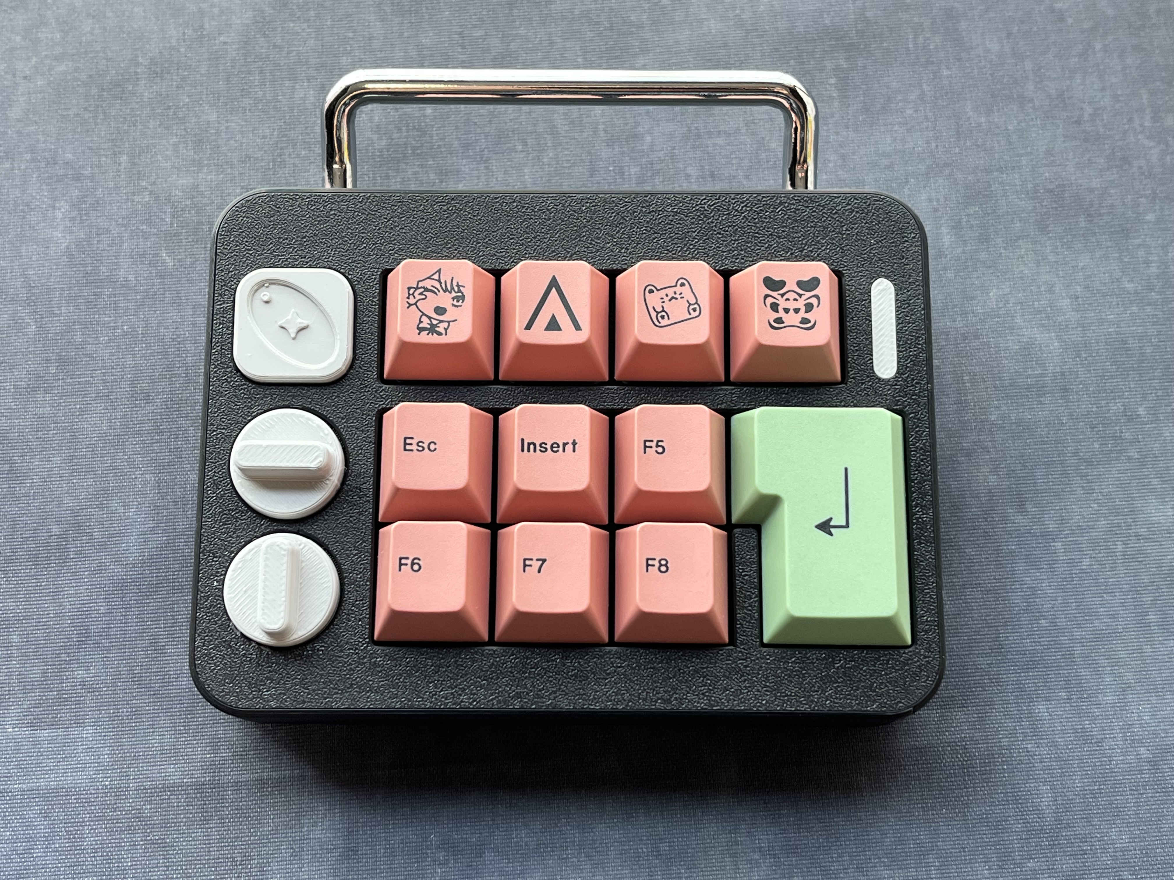
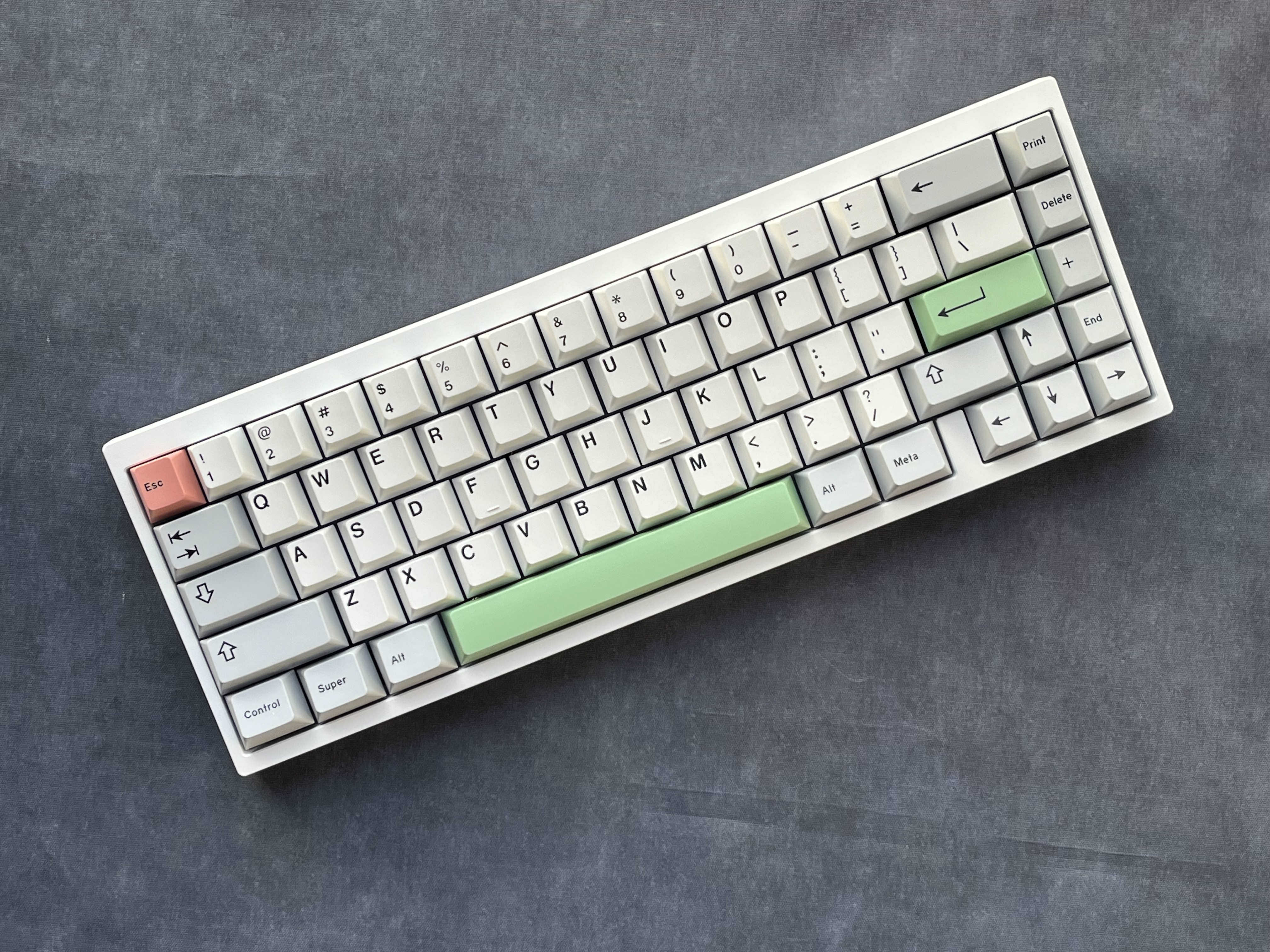
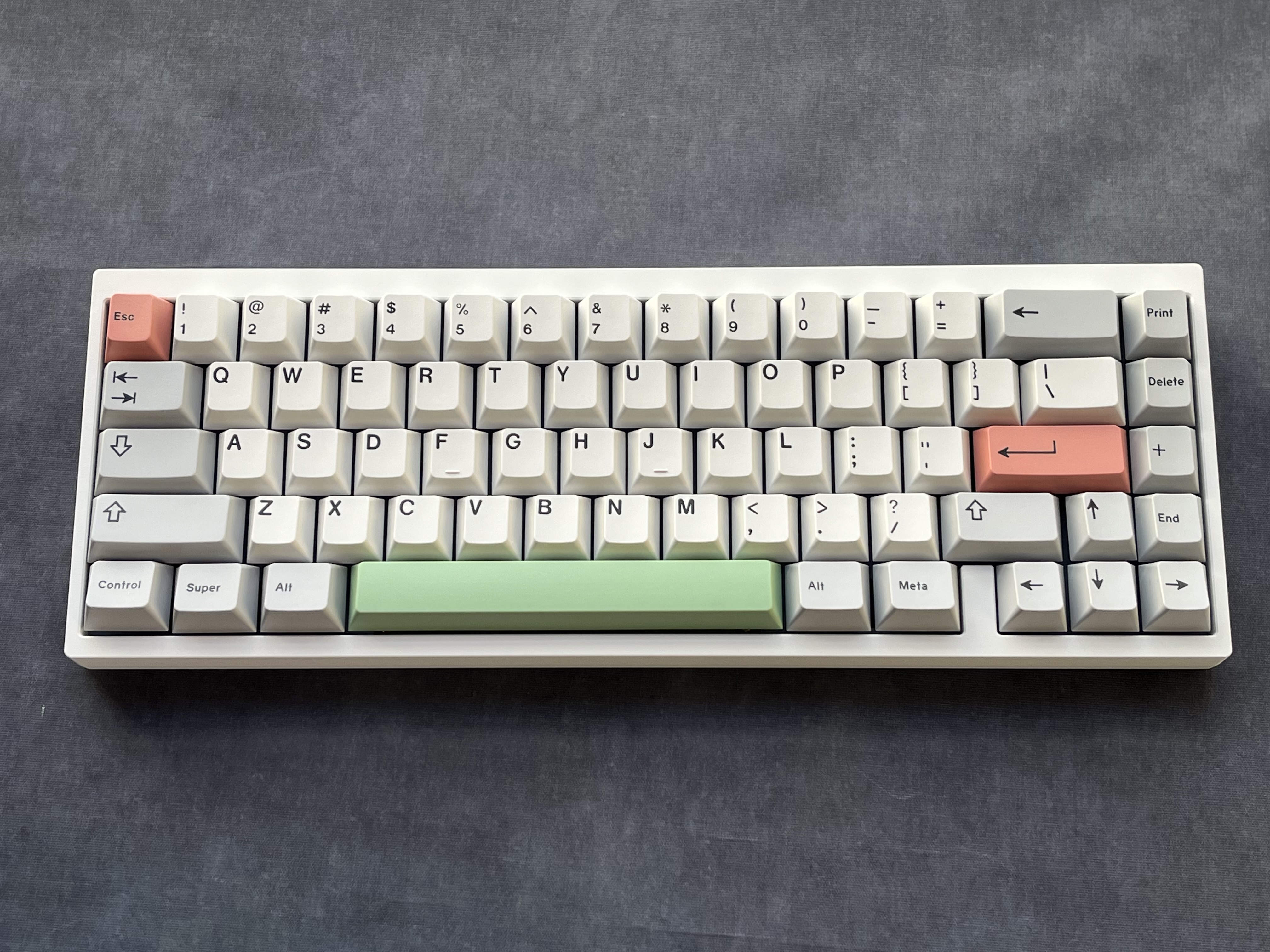
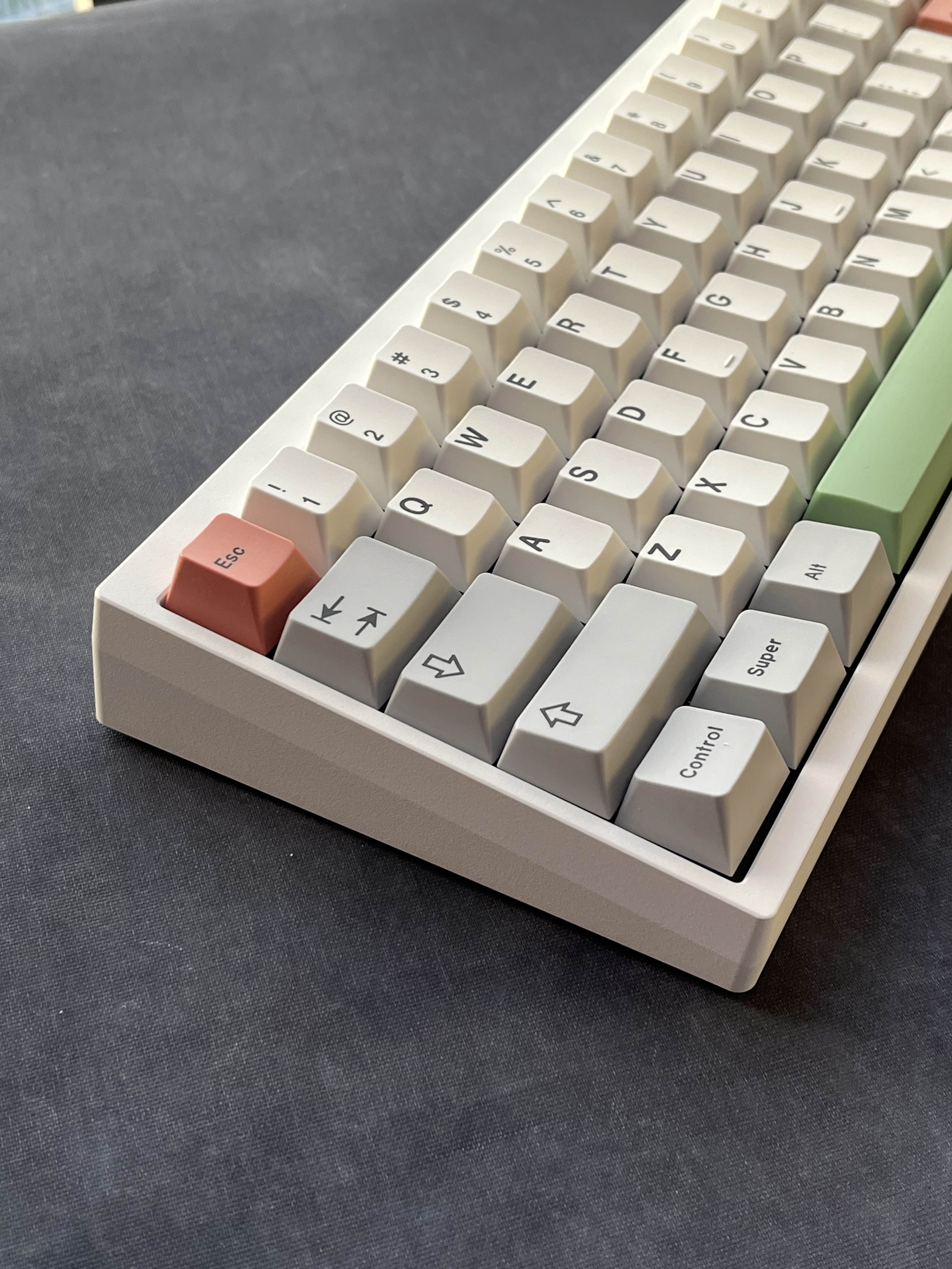
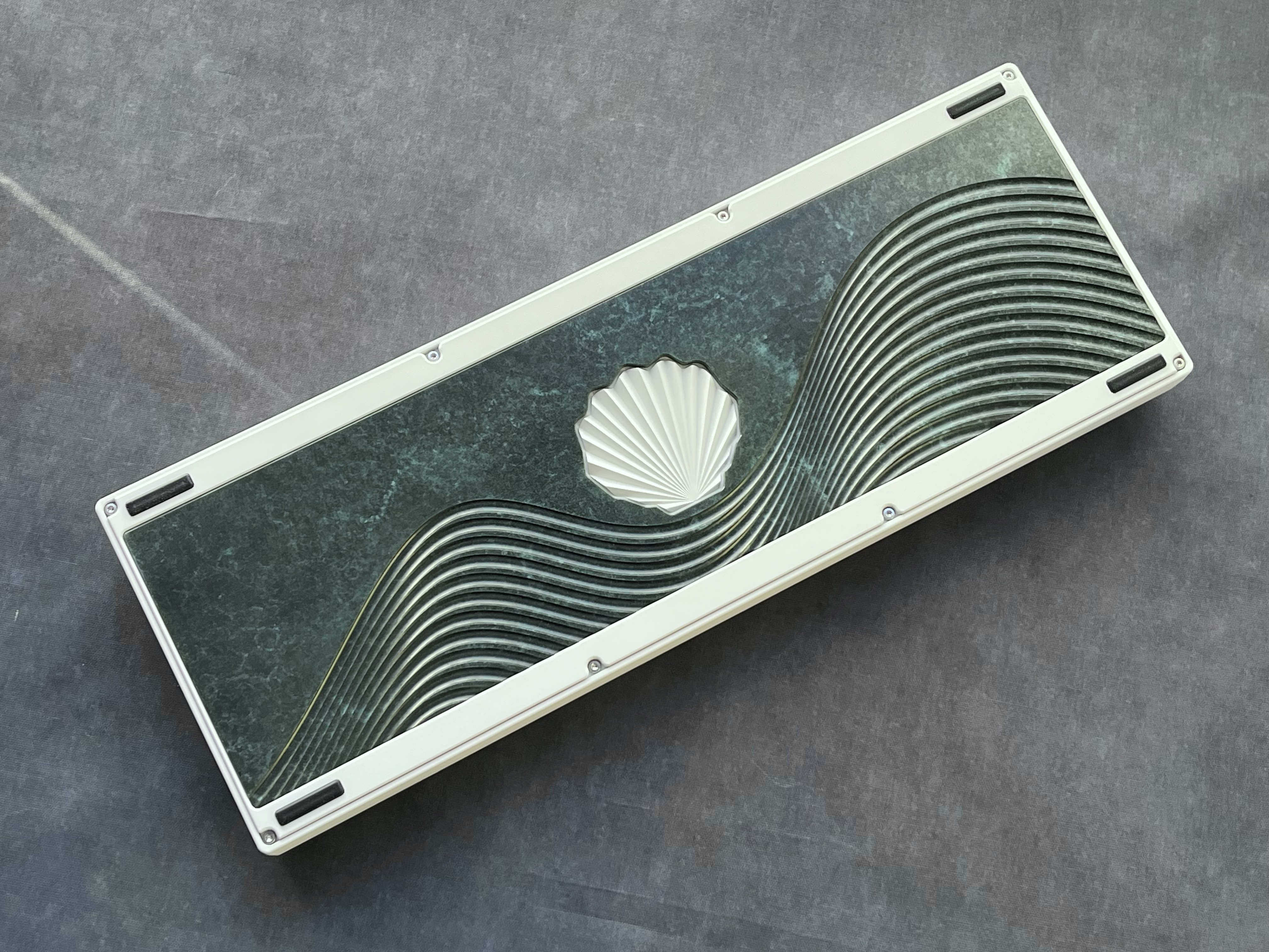
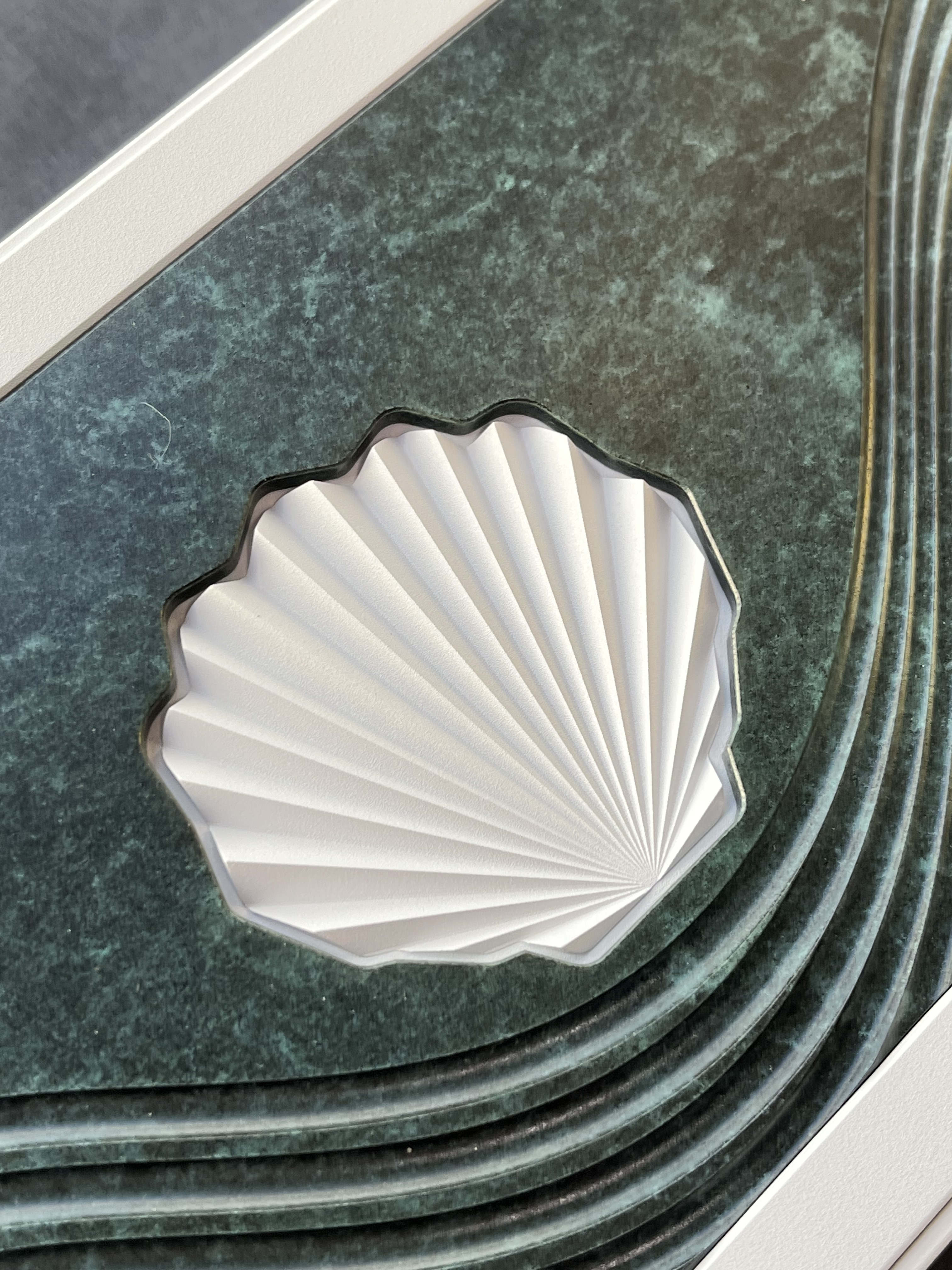
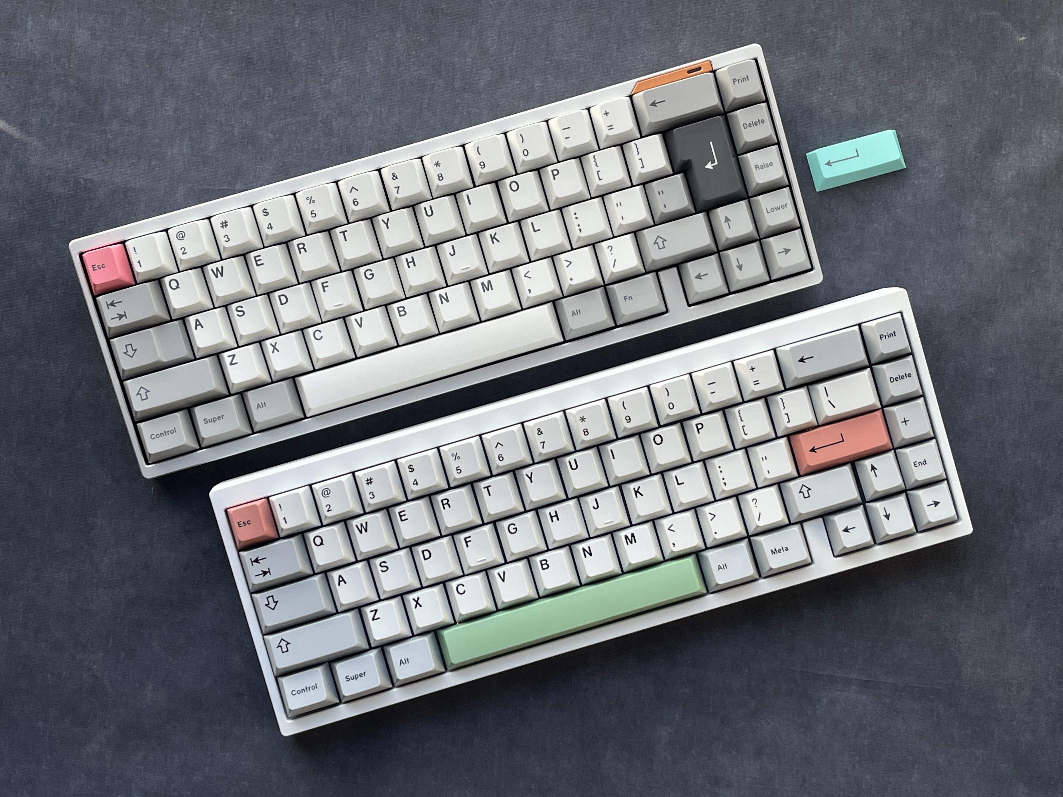
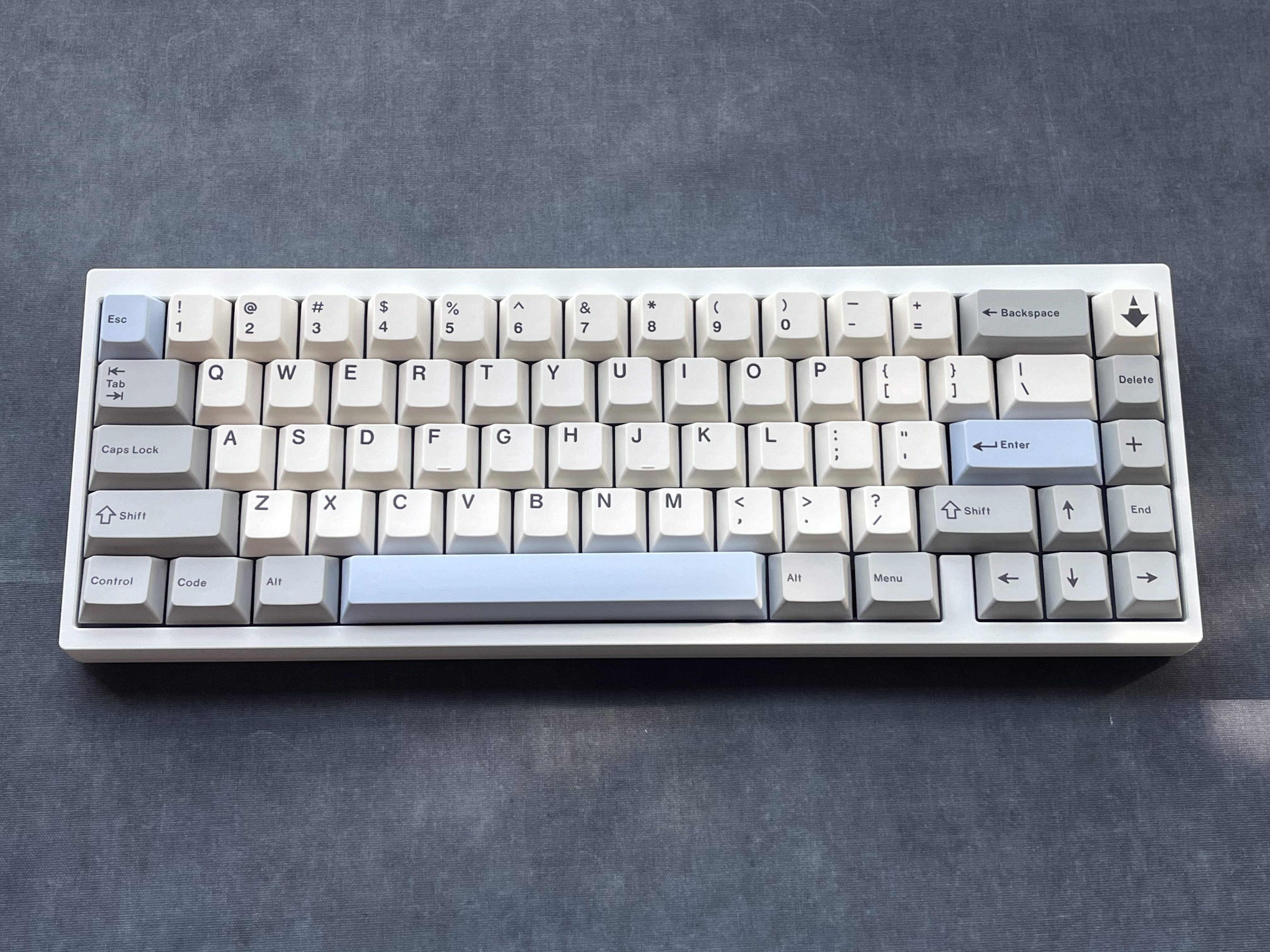

Those pictures show the keyboard and the keycaps that I used to write this post. I think I will add those at the end of my future posts. Let’s see if I could write more often, lol!
The responsive design part is to ensure pictures are shown in decent size on mobile devices where the browser window is very narrow. This may kill the 3 by 3 grid, and the photos will be shown in 2 or 1 per row. I’m fine with showing smaller thumbnails, so I don’t want this behaviour. Therefore, I eventually deleted the responsive design part of the css. ↩︎