To generate figures for publications, I often use matplotlib and seaborn to prepare plots and save them in PDF format. Then I use PowerPoint to arrange and organise them into a full figure. Like this one shown below:
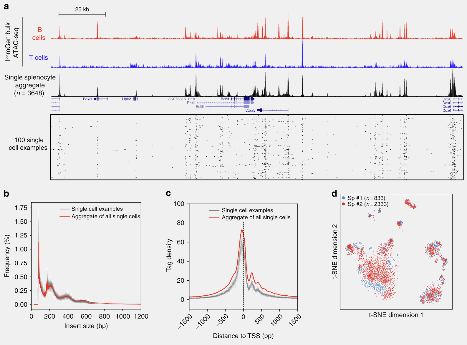
Those panels (a - d) were individually generated using matplotlib (except the genome browser track), saved as PDFs and imported into one slide in PowerPoint. The size of the slide can be set to conform to the requirements of the journal, but A4 size generally works in almost all cases. Labels can be added manually in the PowerPoint using a desired font. Once I’m satisfied, the whole slide can be exported to a PDF, which serves as a figure. We can do this for every figure. In this way, it is easy and straightforward to generate publication-ready figures and they are still in vector format and all the elements can be edited by other programs like Inkscape or Illustrator.
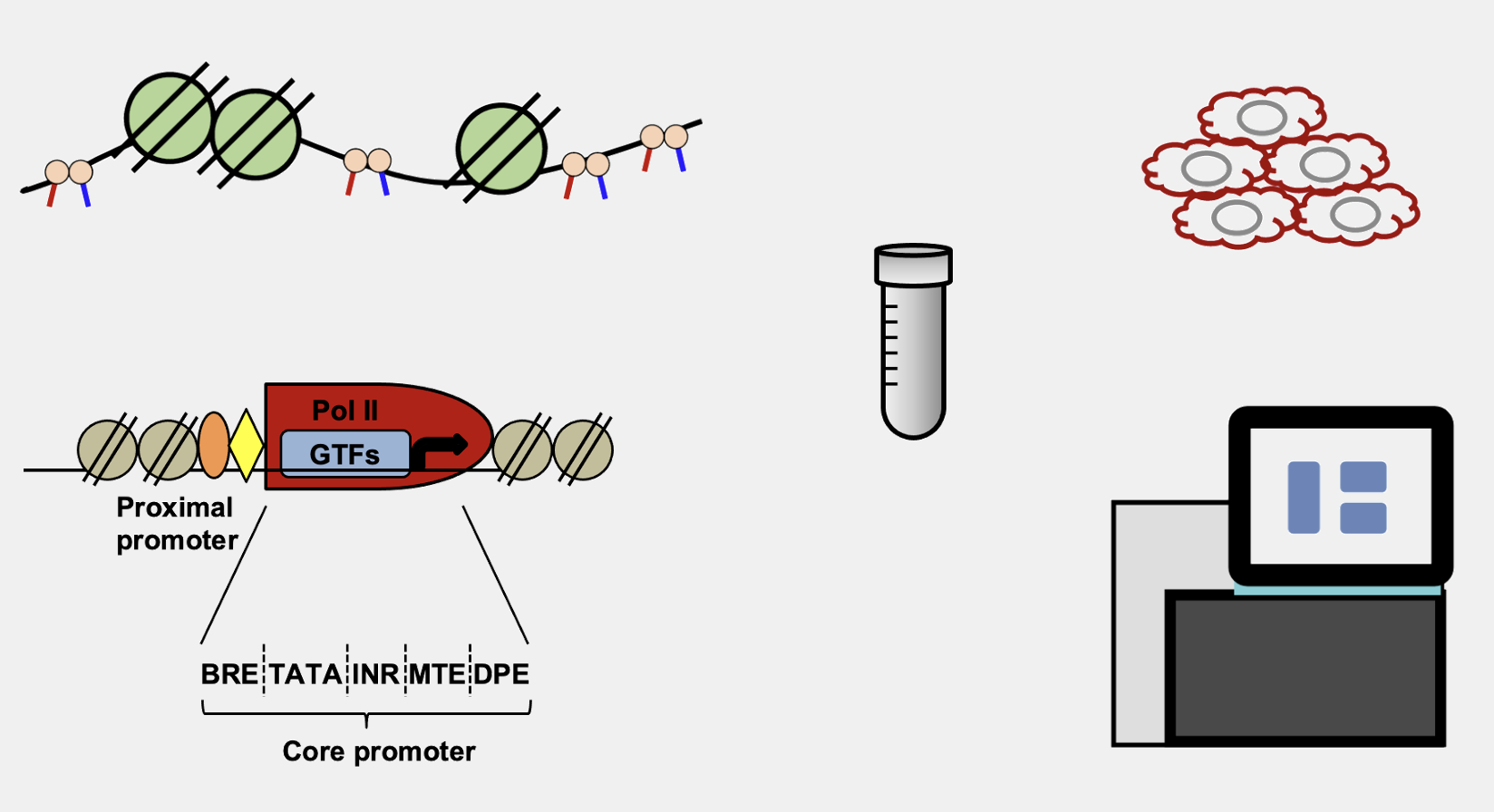
The above routines are enough to produce 90% of my figures, especially for data-related plots which can be easily generated by matplotlib + seaborn. However, there are still things that we need to draw by ourselves, such as schematic views of experiments, like this one shown below:
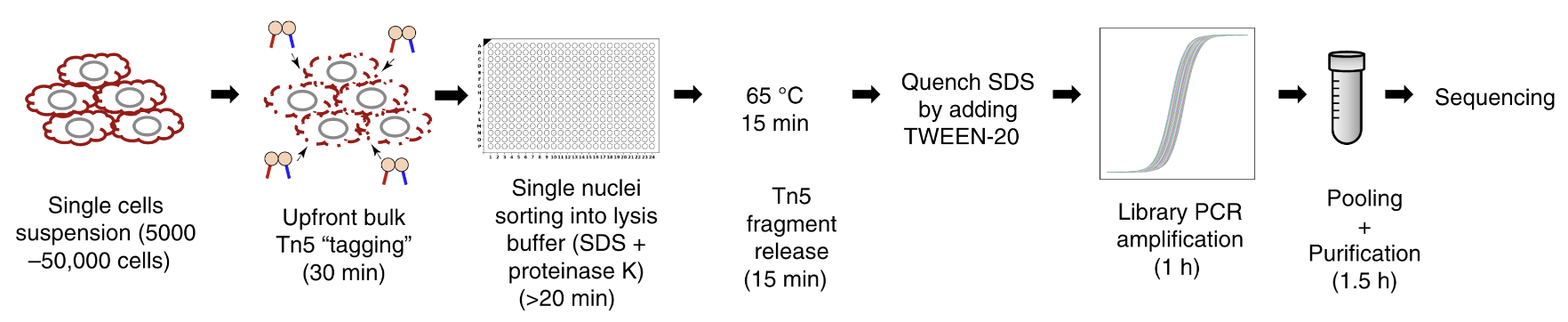
which was drawn using PowerPoint, and that was what I usually did. It is okay. It does the job pretty decently for simple things. For example, the following are all drawn in PowerPoint using its built-in lines and shapes:
That’s about it. Anything a bit more complicated is painful to draw, especially when you want to connect, align and snap different lines, arcs and curves together. Later on, I came across BioRender, which really helped the drawing. The final results are beautiful. Nowadays many people are using it, and I’m kind of seeing the same type of drawings in different papers over and over again! On top of that, the licence becomes a bit complicated if we publish in open-access journals. Therefore, I would like to avoid using it.
Recently, I need to draw a schematic view of the droplet single-cell sequencing technology. There is this nice drawing in the BioRender library:
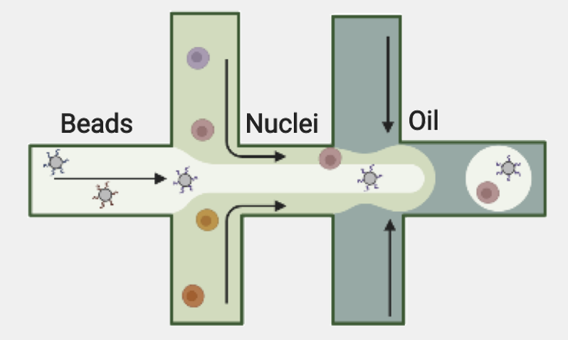
That’s really beautiful and we used it in Figure 1a and Figure 2a from our ISSAAC-seq paper. Now I want a change and make my drawing to be unique. For this purpose, many people would use Inkscape or Illustrator, but I don’t know how. Finally, I decided to use TikZ, because … it can generate vector graphics, so why not?
To start with the prototype, I looked at the microfluidics device of inDrop from the supplementary movie in their Nature Protocols publication. Then I draw the outlines in papers with grids, like this:
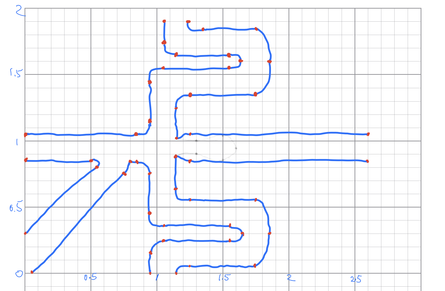
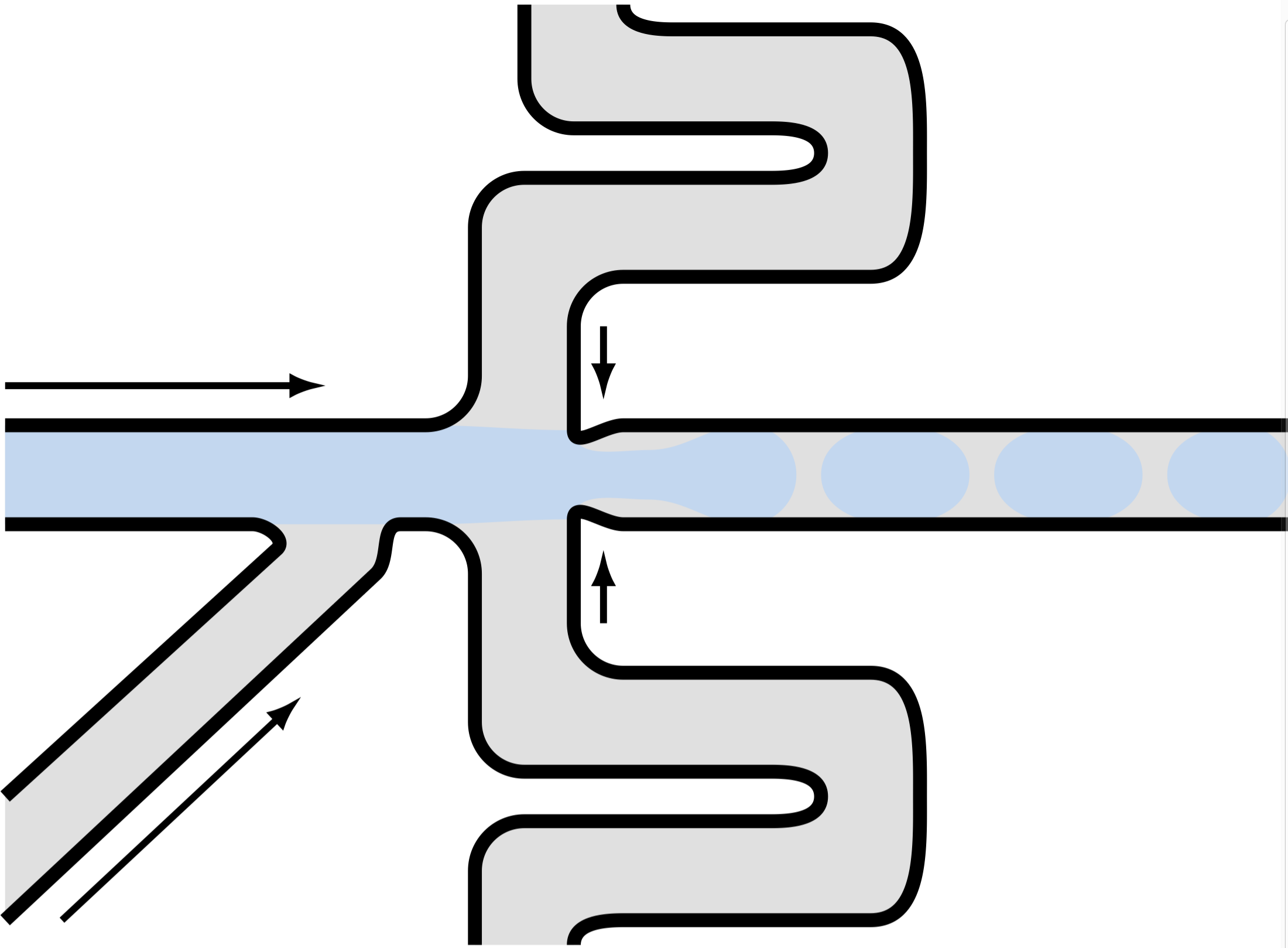
I also marked by red the vertexes, or “connecting points”, where two different lines or curves intersect. Since the drawing is in a paper with grids, I roughly know the coordinates of those vertexes. Then I connected those vertexes using lines by TikZ. The curved lines were drawn by simply using different values of in= and out= options, and let TikZ take care of how the curve should be drawn. It turned out that the default TikZ handled this pretty well:
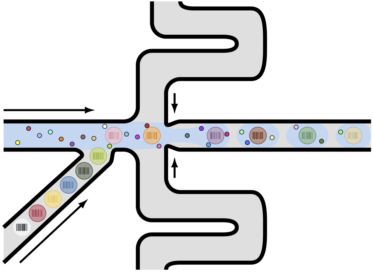
Then I draw some big and small circles to represent hydrogel beads and cells, respectively. On top of that, I used the pst-barcode package to generate barcodes inside the droplet. This is the final result:
The code to generate this figure is in this GitHub repository: TikZ And PGFPlots Draw. There are some other drawing, and I’m planning to add more.
After I posted the drawing on Twitter, Florian recommended Ipe, which is a simple and versatile drawing editor to generate vector graphics in PDF format. After watching these three short videos, I became a fan! To get my hands on it and learn the basics, I re-create the droplet figure using Ipe:
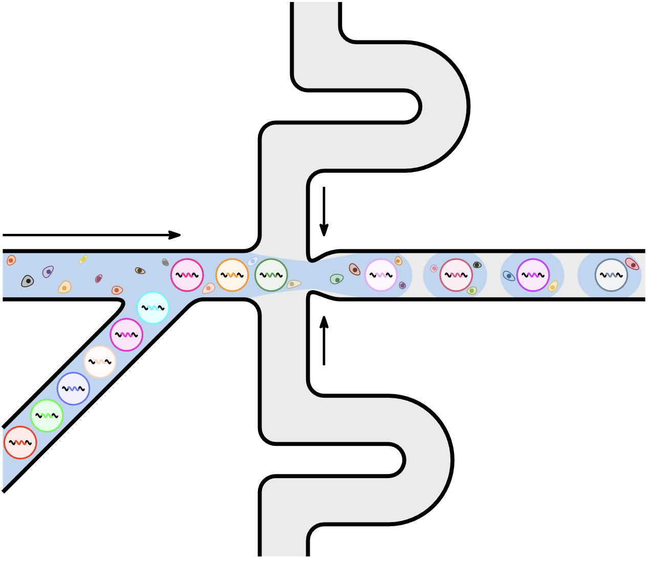
The ways Ipe handles snapping and path joining are really nice. It is more flexible in terms of creating shapes, so that I could create irregular shapes to represent cells. For TikZ, I could draw stuff more systematically, especially with the help of additional $\LaTeX{}$ packages. I guess I will use both in the future.